In Good Company - Minimalist and Impactful Website
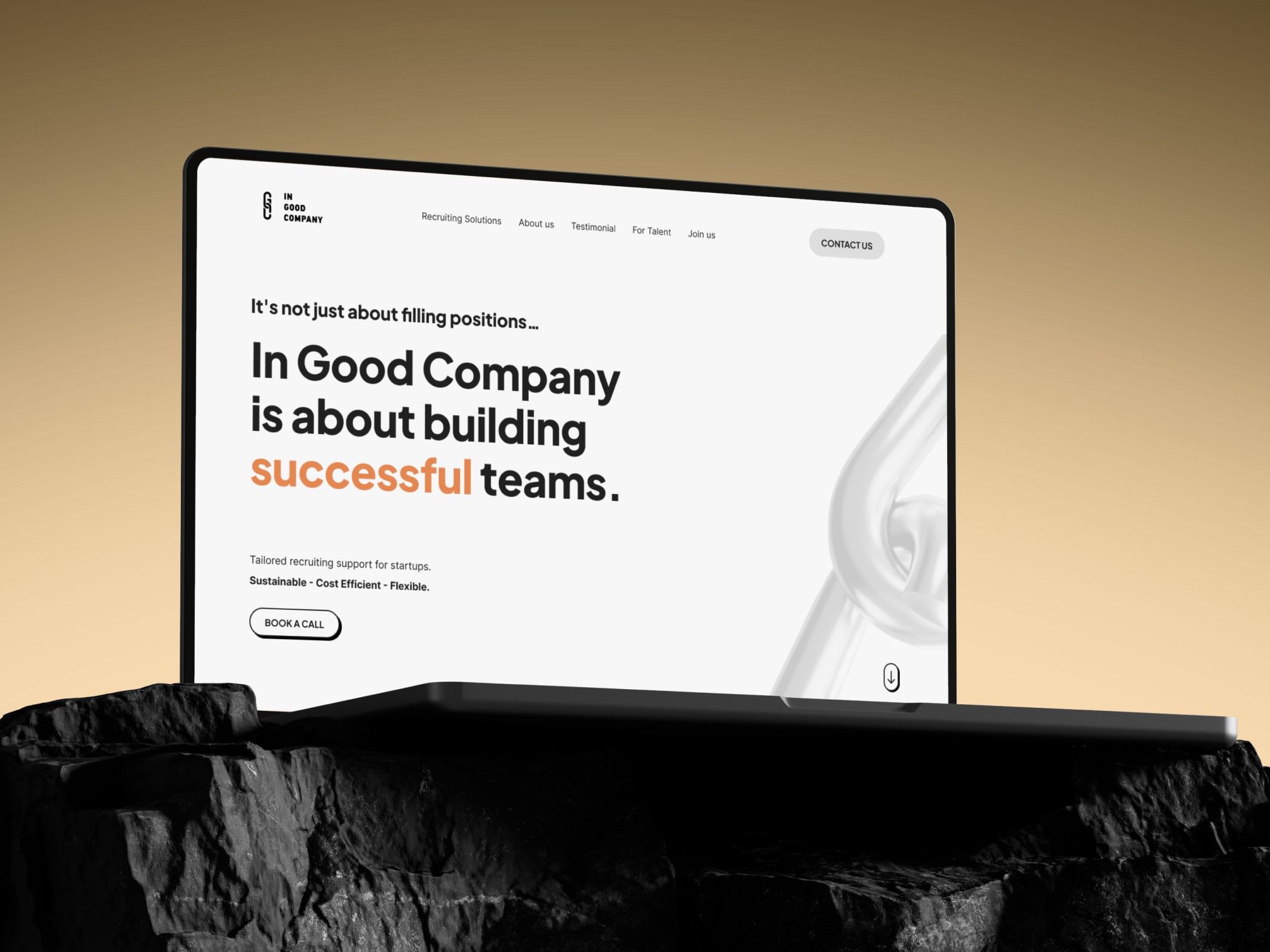
IN GOOD COMPANY is not a typical agency—but a startup‑facing recruiting partner focused on executive hires and flexible team support. With a small but mission‑driven team in Berlin, they deliver a deeply customized, relationship‑centered approach powered by tech. They’re scaling and open to strategic hires, especially those looking to join as co‑founders or team leads.
01 - Goals
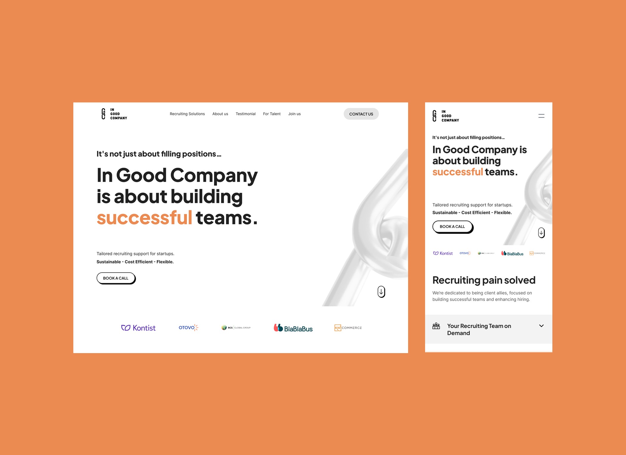
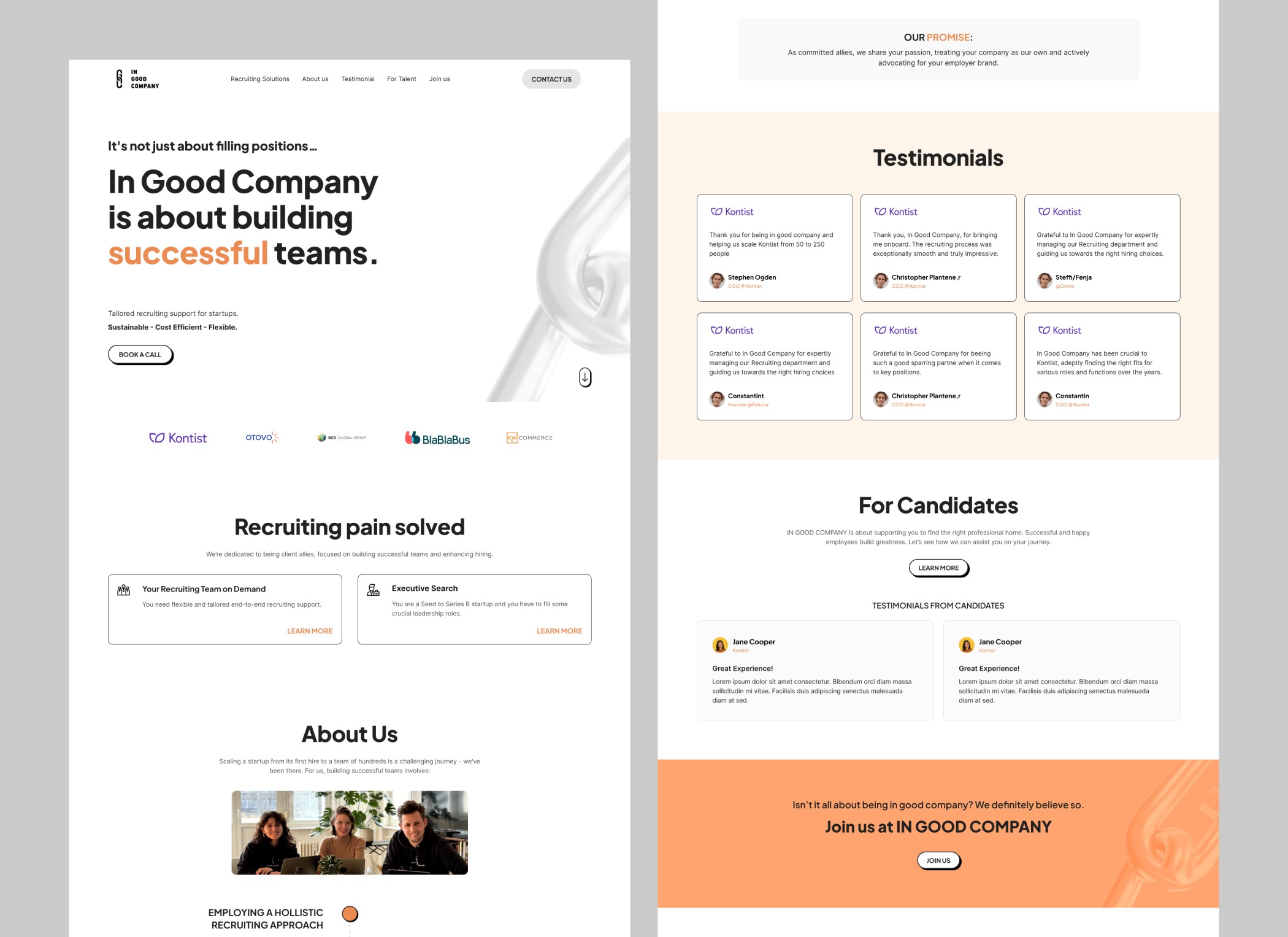
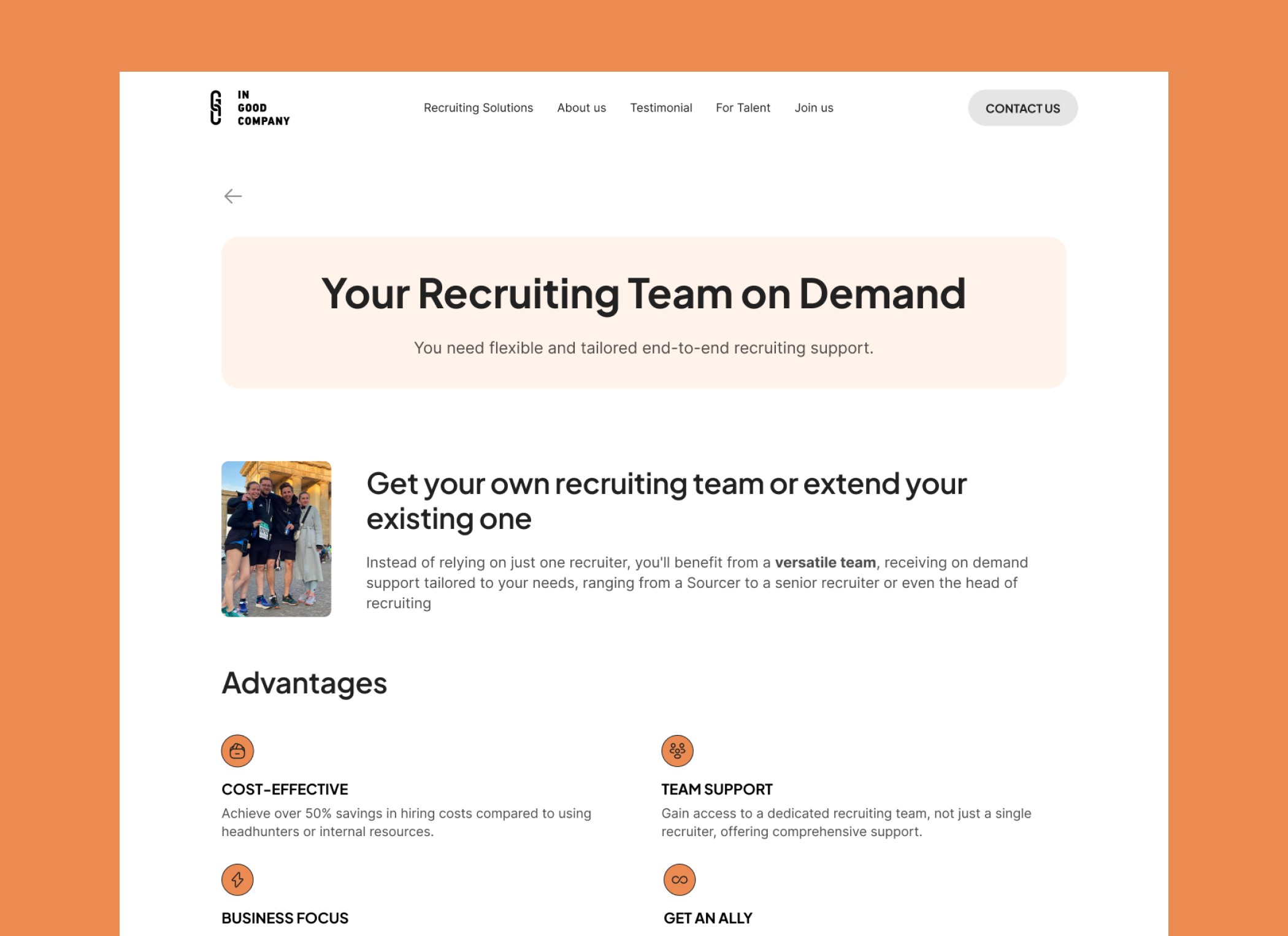
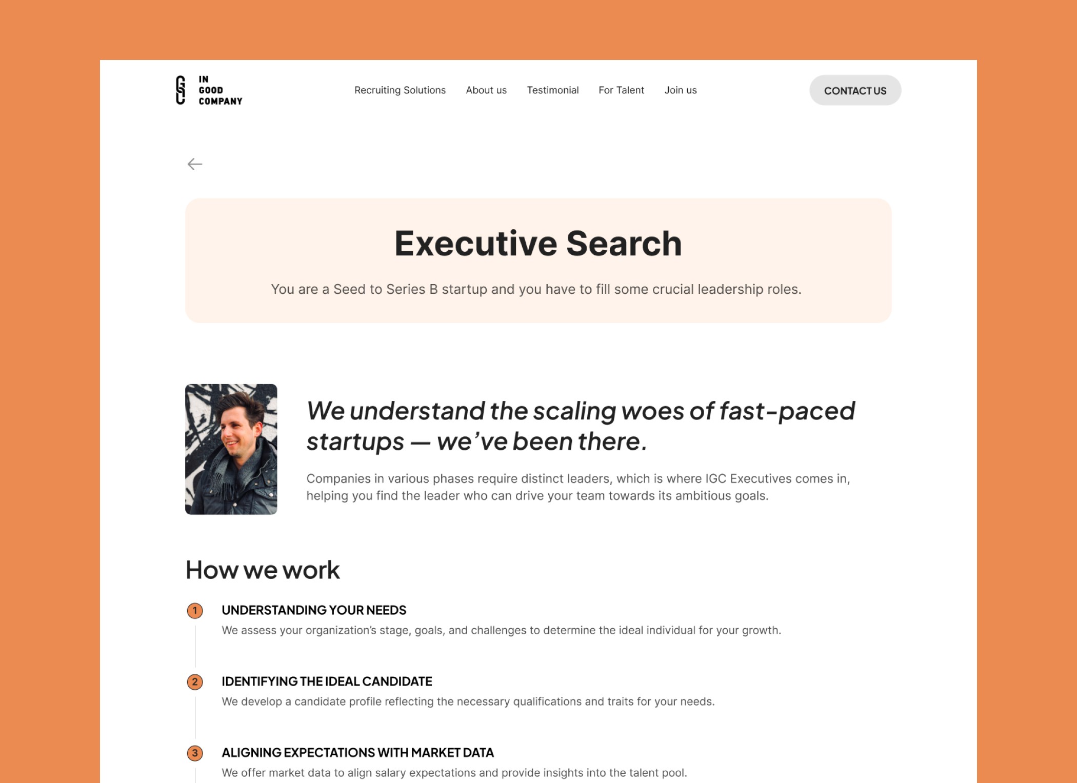
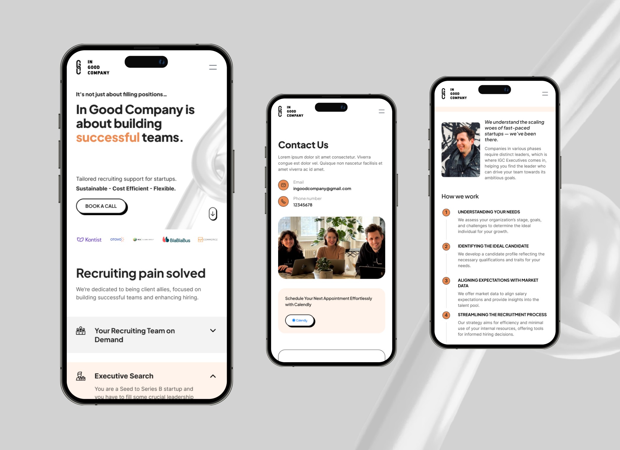
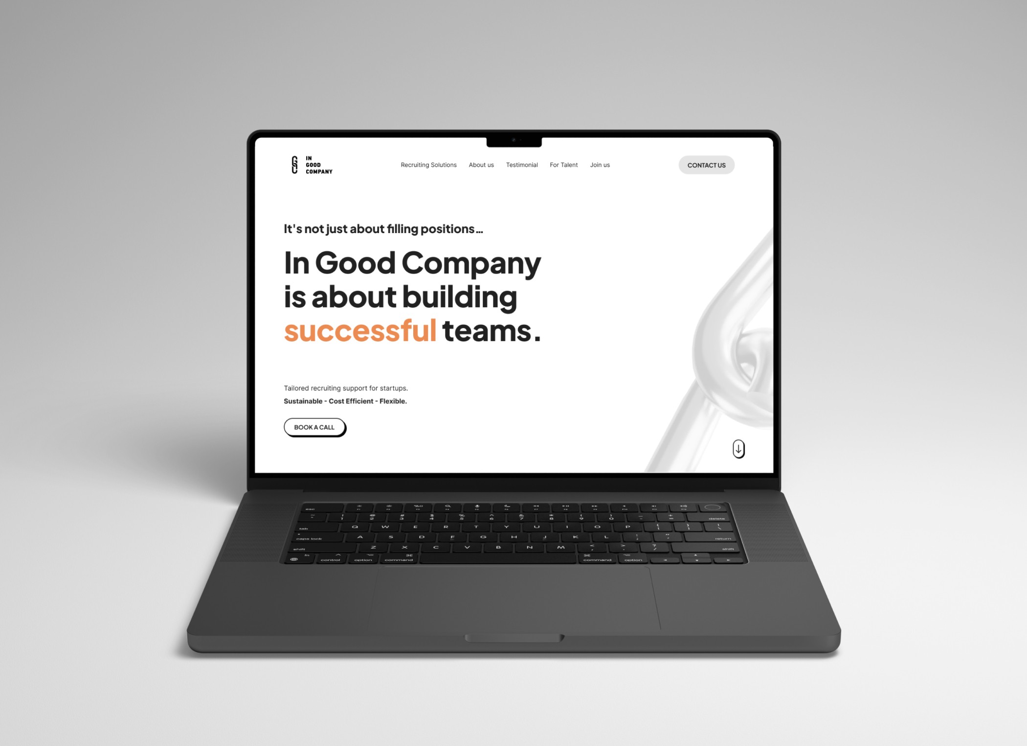
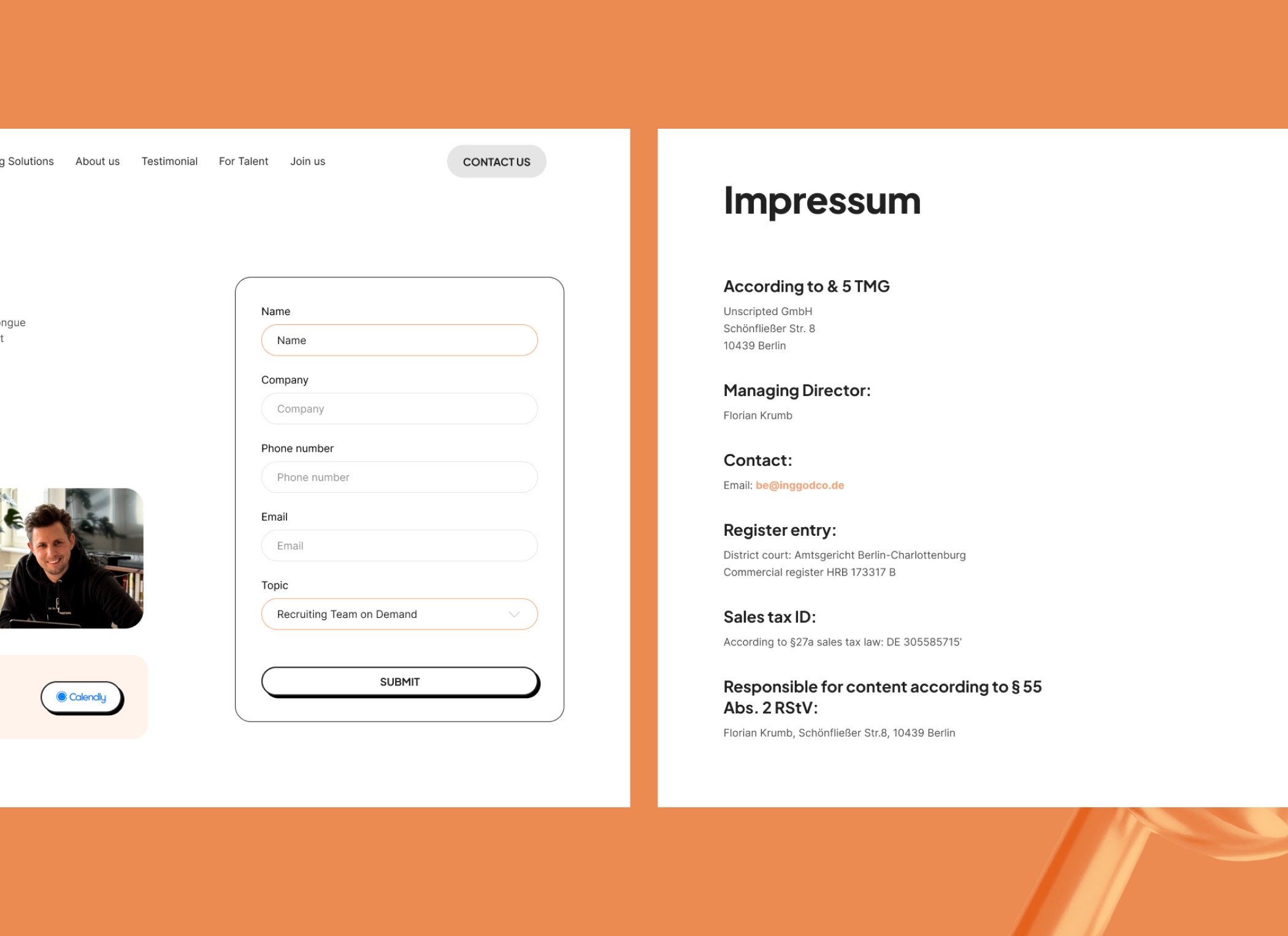
To create a website with a minimalist style that reflects the brand and to the point. Also, to transport the core message/ emotions without overwhelming the visitor because of too much information.
02 - Core Problems
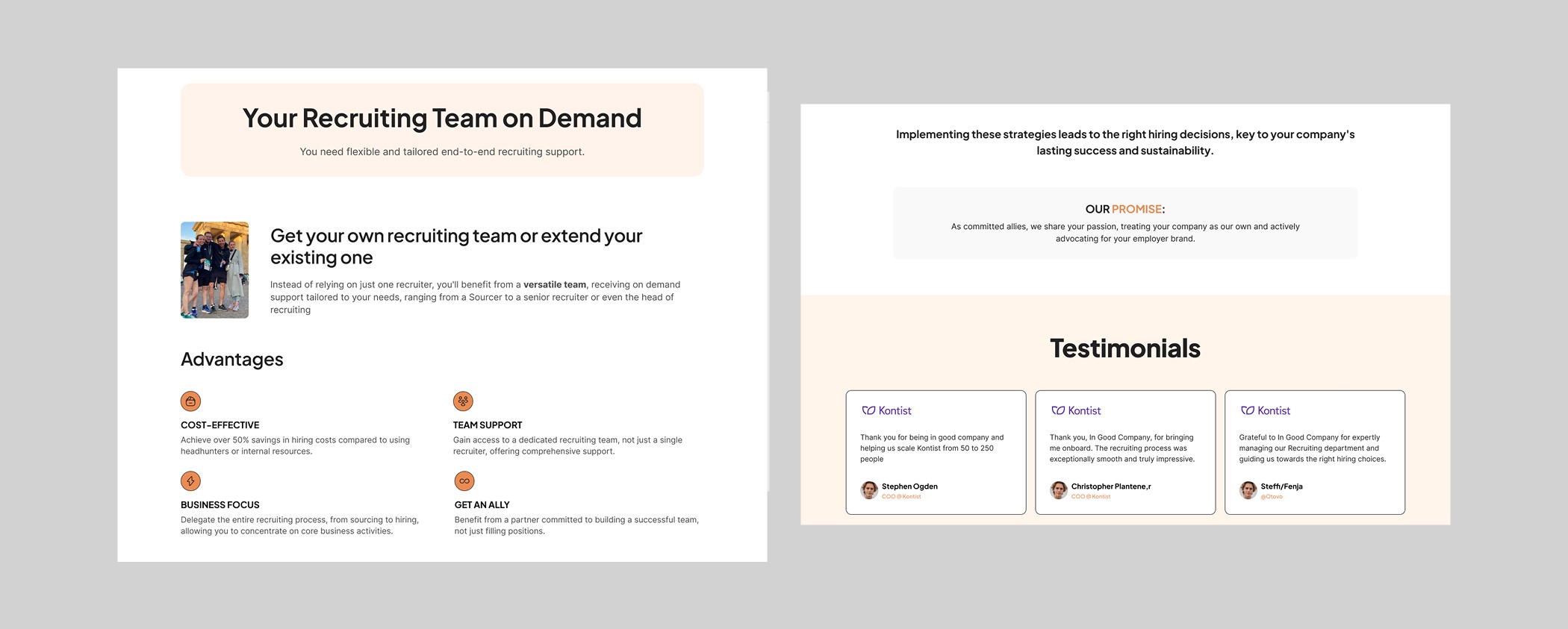
After discussing with the client, several key challenges emerged that shaped the direction of the project:
Balancing Information Density with Visual Clarity
In Good Company had a large volume of content that needed to be communicated—ranging from their mission and services to insights and community initiatives. The challenge was to organize and present this information in a way that felt structured and digestible, without overwhelming users.Branding that Resonates and Converts
The design had to authentically capture the essence of In Good Company’s brand—modern, thoughtful, and professional—while also speaking clearly to its target market. It was essential that the visual language aligned with the brand’s tone and values while maintaining clarity and focus.Strategic Use of White Space
A critical requirement was incorporating ample white space to enhance readability and sophistication. The challenge lay in using this space strategically so the design felt elegant and purposeful, not empty.
03 - Solutions
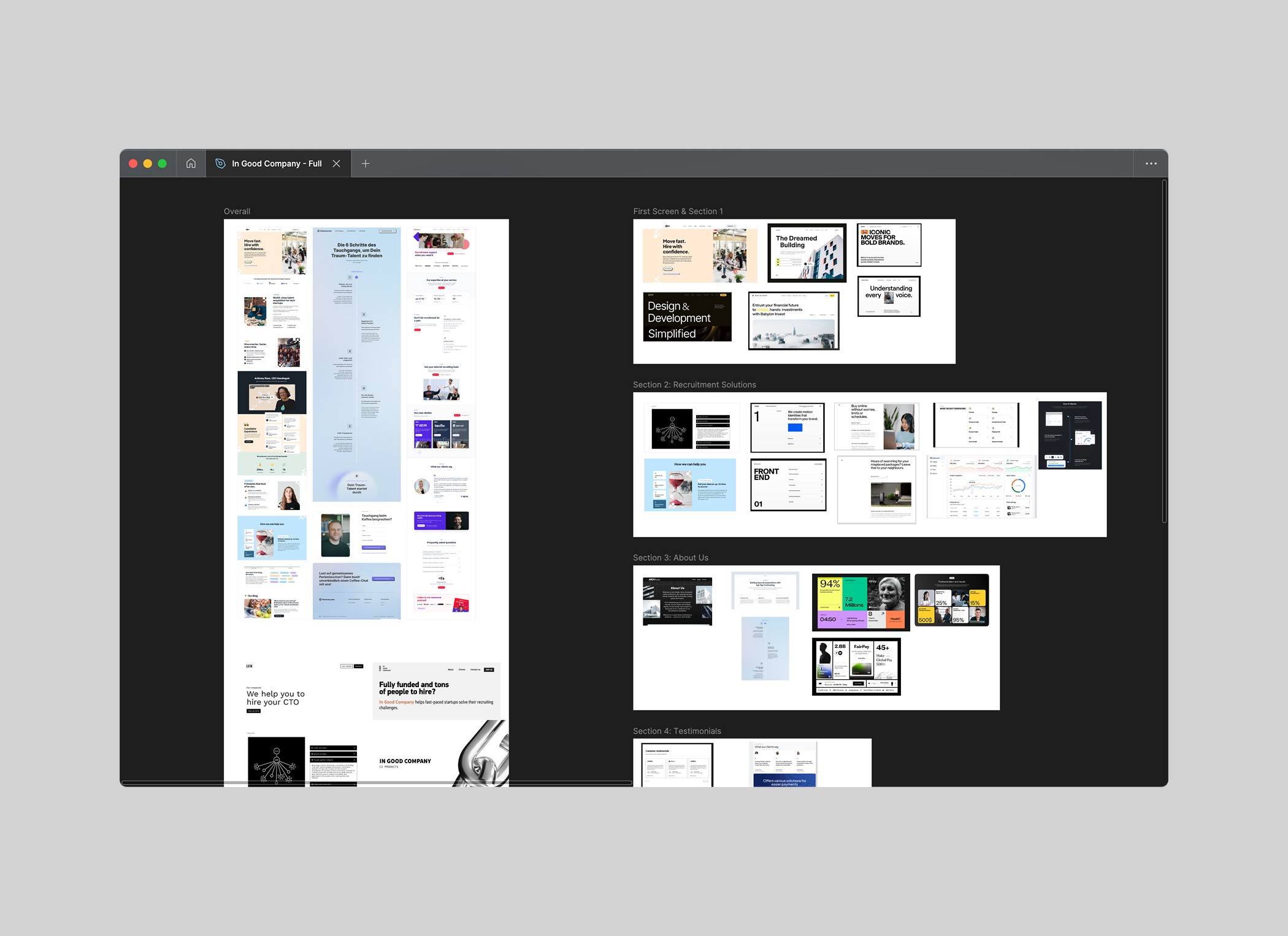
To address the identified challenges, I approached the design with a clear strategy rooted in structure, hierarchy, and brand sensitivity:
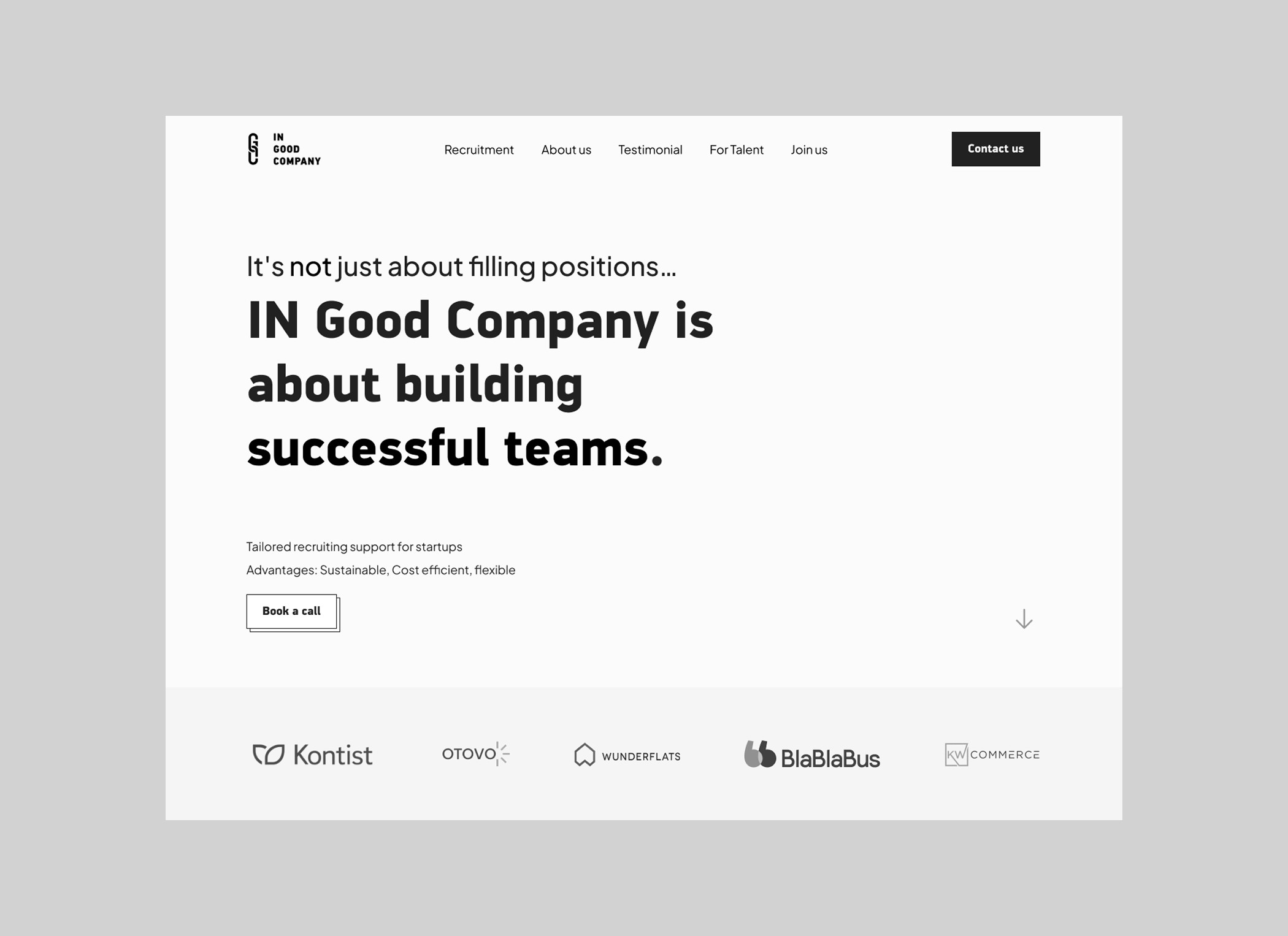
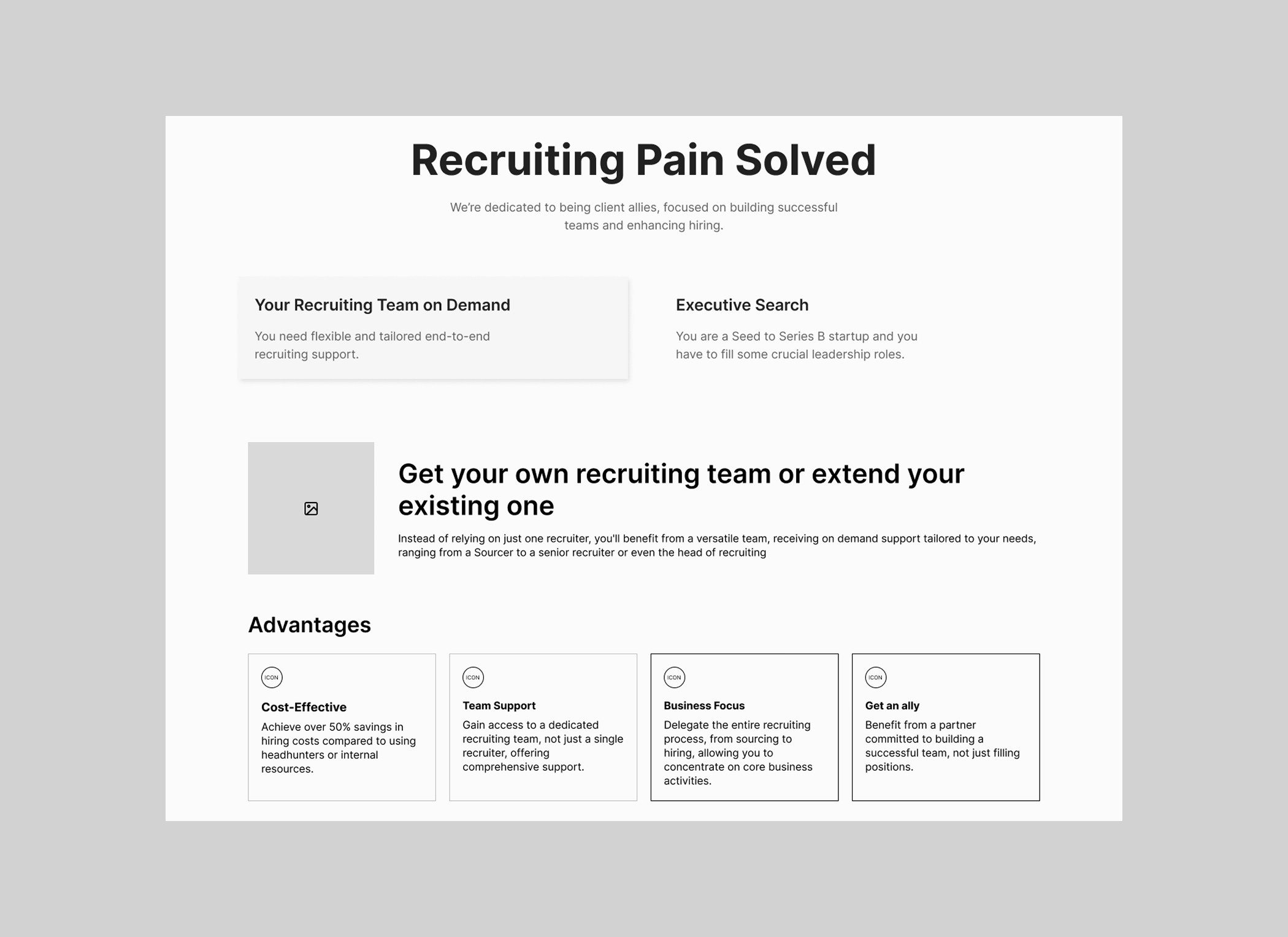
Clear Content Structure & Visual Hierarchy
I began by organizing the content into clear sections with intuitive flow. Strategic use of typography, headings, and spacing helped guide users through the information seamlessly. Key messages were prioritized, while secondary content was made accessible but unobtrusive.Brand-Centered Visual Direction
I translated In Good Company’s brand values into a modern and minimal visual language. This included a refined color palette, clean typography, and thoughtful design elements that reinforced professionalism while remaining approachable. Every design choice was made to ensure consistency with the brand and resonance with the target audience.Thoughtful Use of White Space
I carefully designed layouts with generous white space to provide visual relief and elevate key content. By balancing white space with well-placed visuals and content groupings, the design felt clean and open—never empty. This allowed the user experience to feel calm, focused, and confident.
04 - Outcome
Want to see more? Visit the website